OSTRA — tide, texture, table ritual.
SCOPE OF WORK
Identity · Hospitality Art Direction · Menu System · Collateral · Digital
01 — OverviewA coastal table, shaped by small rituals.
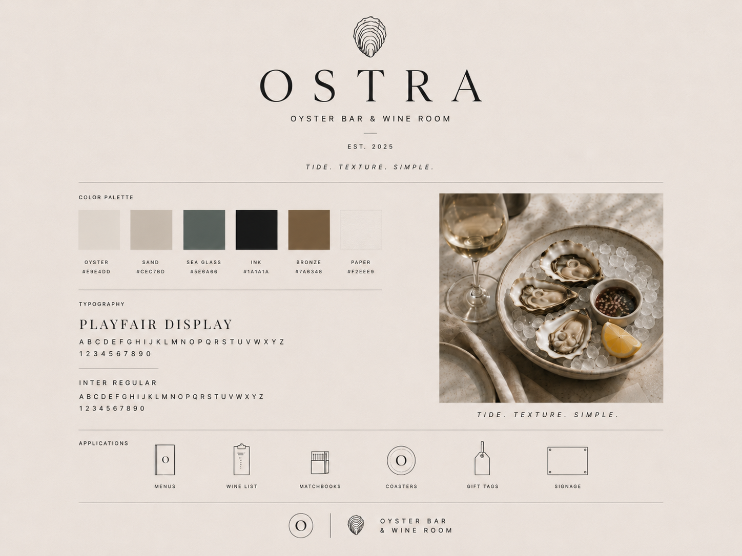
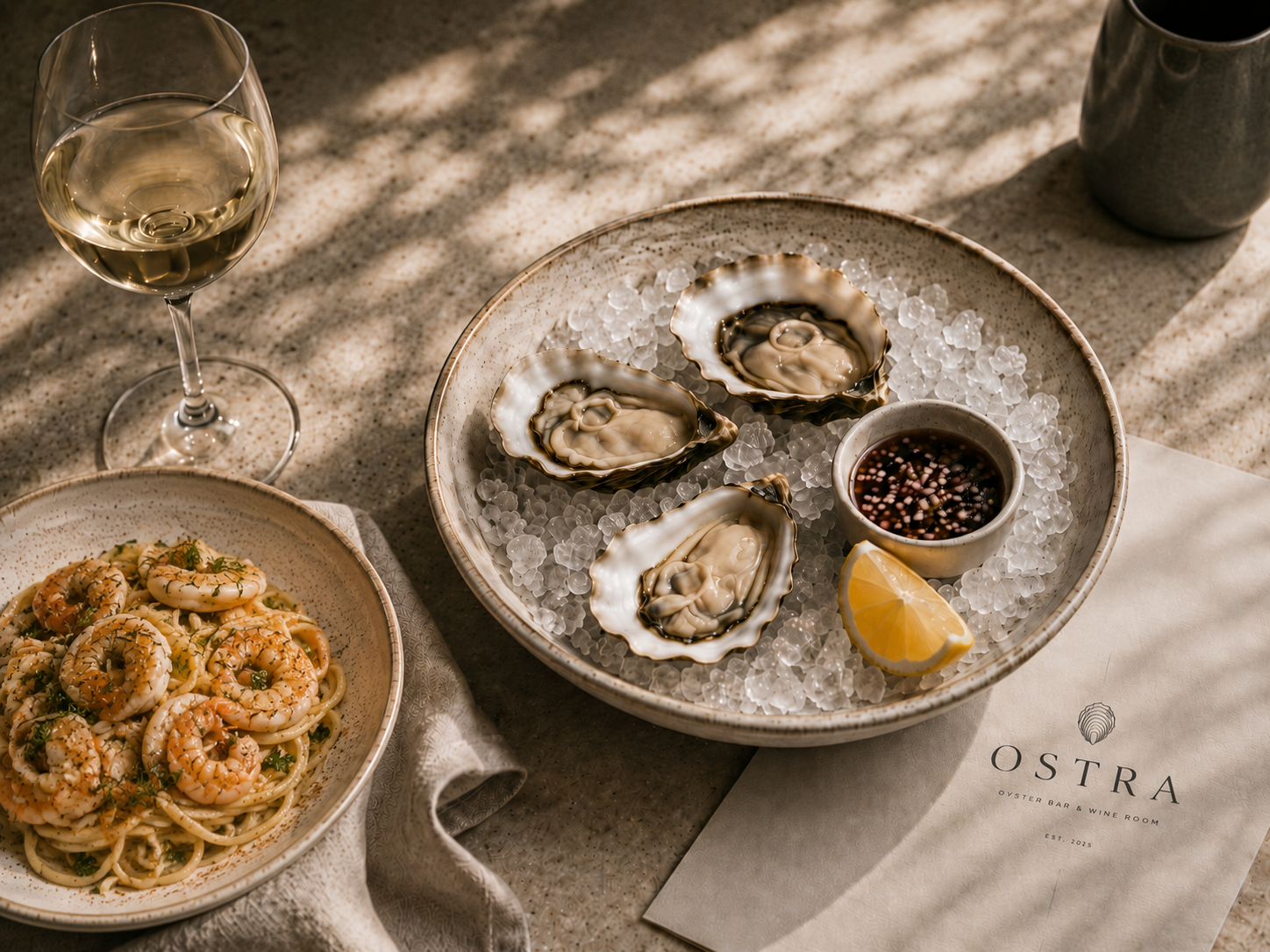
Ostra is a conceptual oyster bar and wine room built around the rituals of coastal dining: the half-shell, the pour, the matchbook, the reservation card, the weight of a menu in hand. Rather than leaning into nautical cliché or generic minimalism, the identity uses quiet texture, editorial typography, and tactile service details to create a restaurant system that feels intimate, coastal, and considered.
02 — APPROACHSet like a table.
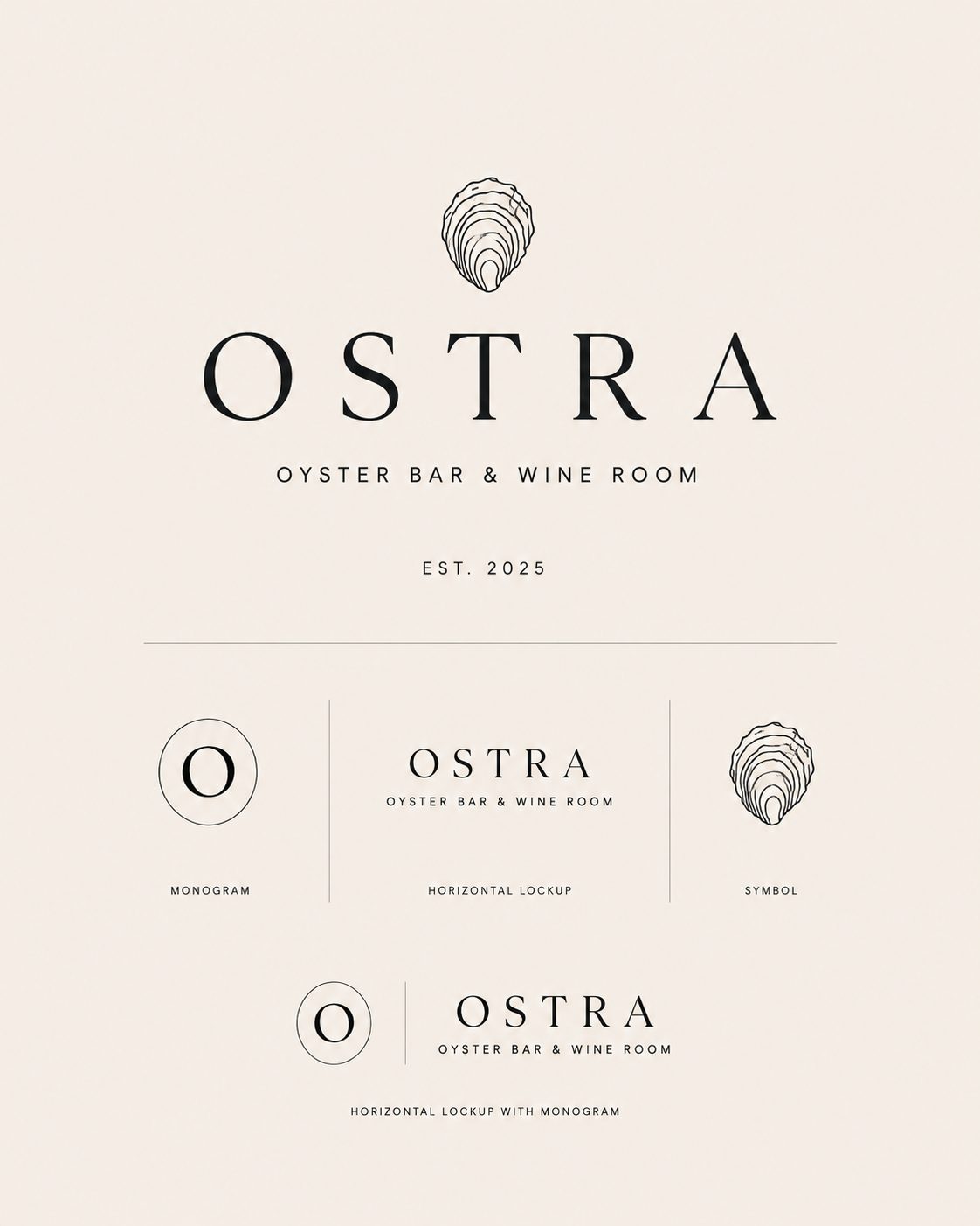
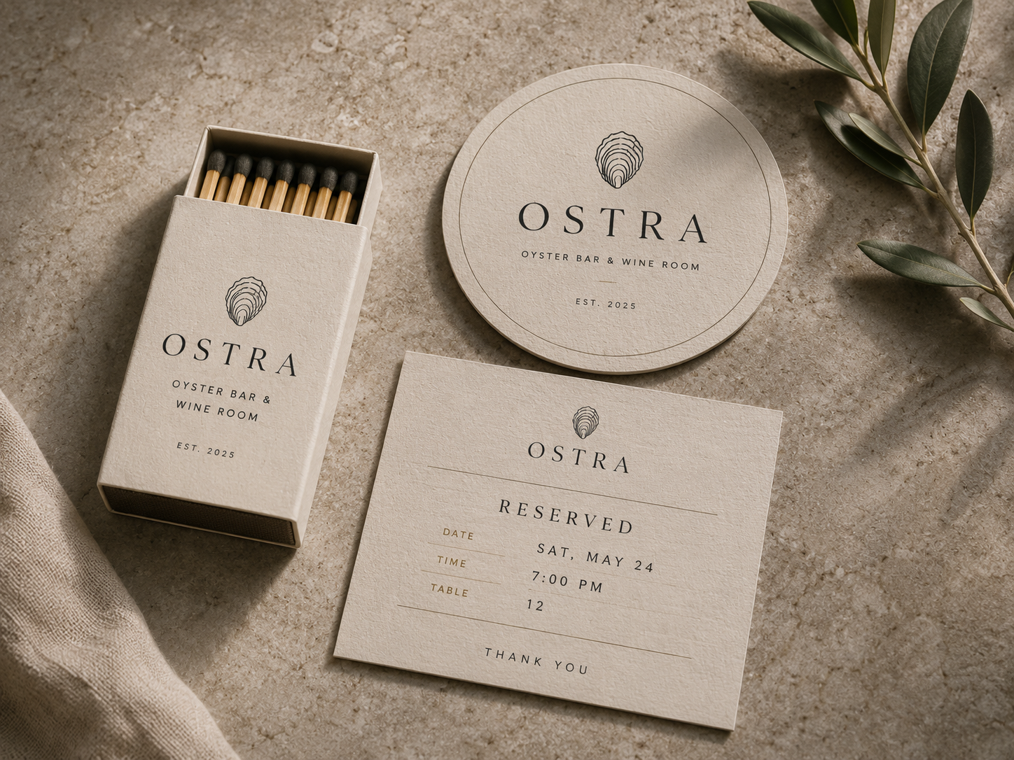
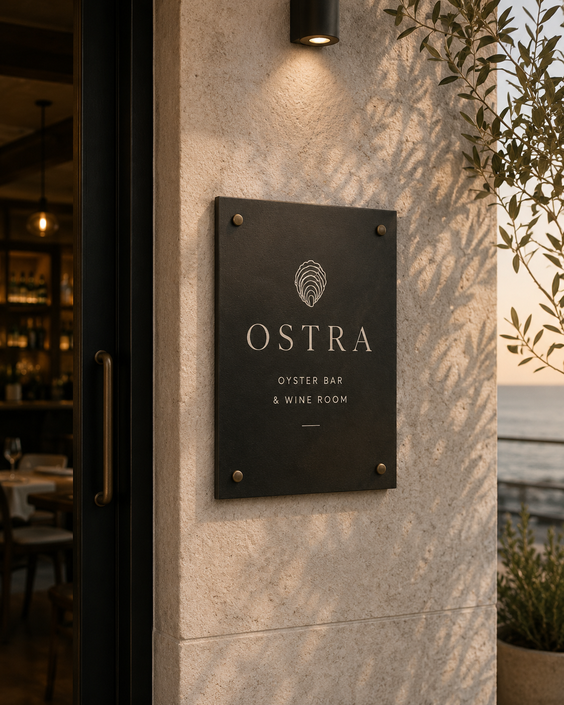
Editorial wordmark and shell mark.
The wordmark reads more like a masthead than signage, supported by a refined shell glyph used across menus, coasters, matchbooks, reservation cards, and digital touchpoints.
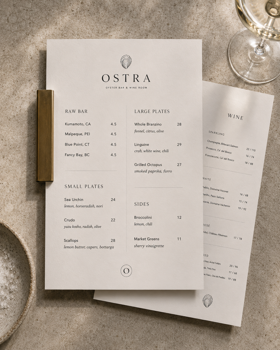
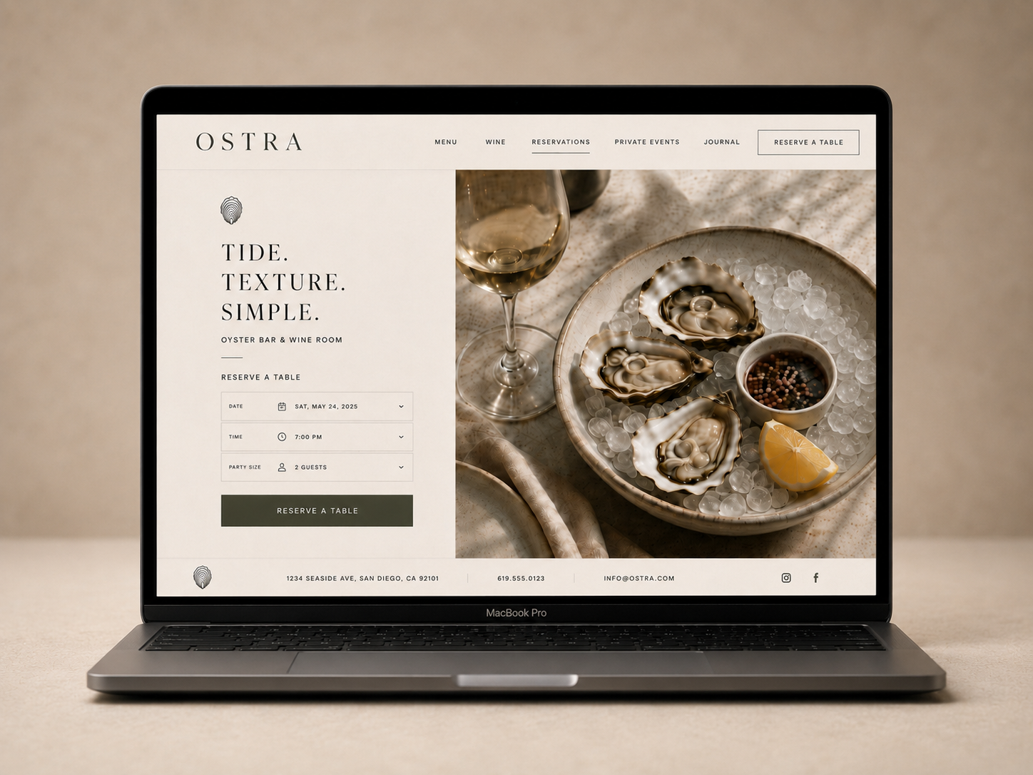
Menu as primary surface.
The menu and wine list become the center of the system. Paper weight, spacing, hierarchy, and tone create a tactile editorial experience before the food arrives.
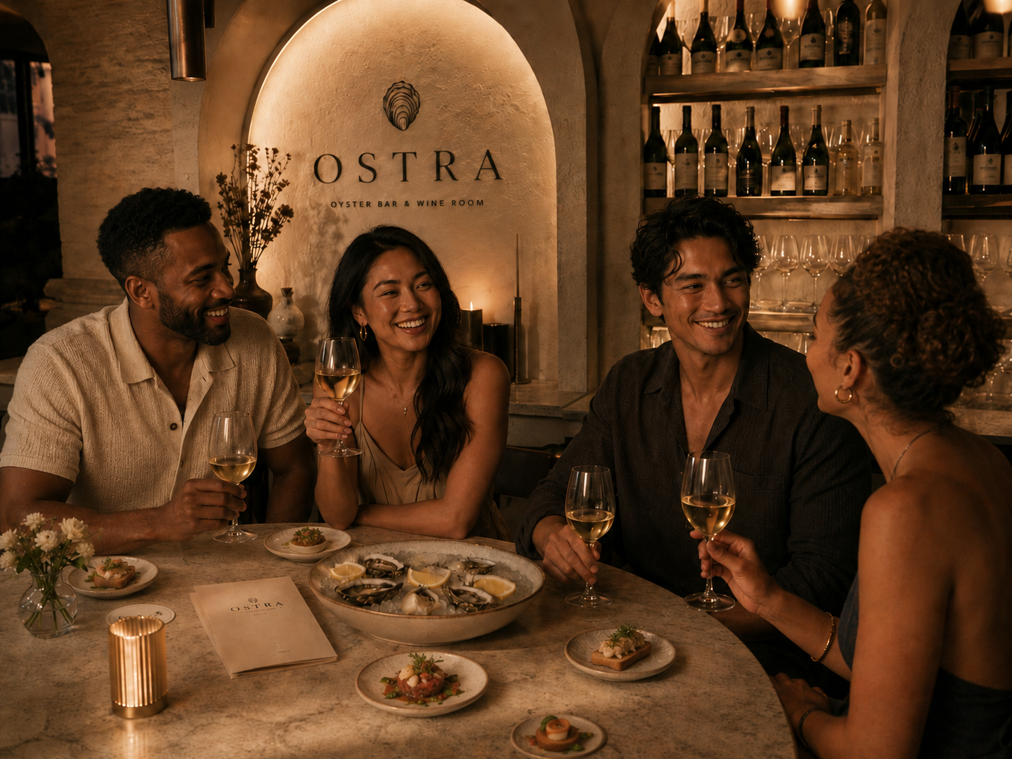
Service as brand behavior.
The identity extends into the details of service: table settings, bottle moments, printed cards, staff cues, and guest-facing materials. The brand lives through the rhythm of the room, not only through the logo.


03 — IN PRACTICEService before surface.
Ostra tests how a restaurant identity can be built around the gestures of hospitality: ordering, pouring, serving, seating, and remembering. Across menu design, wine-room collateral, reservation materials, signage, and digital booking, the system is designed to feel textured, warm, and quietly polished.