FORTUNE SOCIETY —
building a visual identity for reentry.
SCOPE OF WORK
ROLE
Brand Guidelines · Strategy · Visual Identity · Internal Communications · Logo Color Modernation
CLIENT
Fortune Society
LOCATION
Queens, New York City, NY
CASE STUDY EXTENSIONS
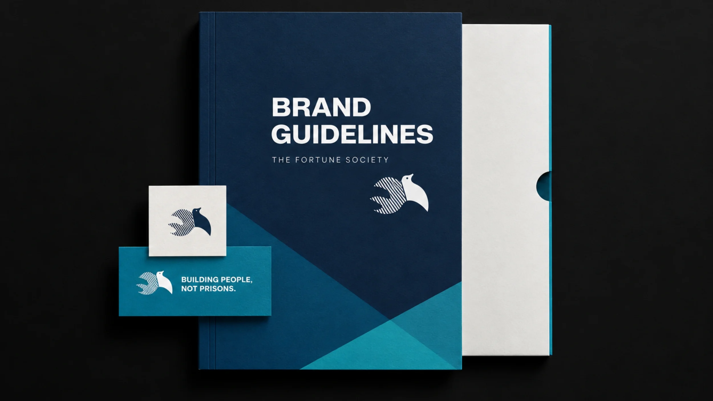
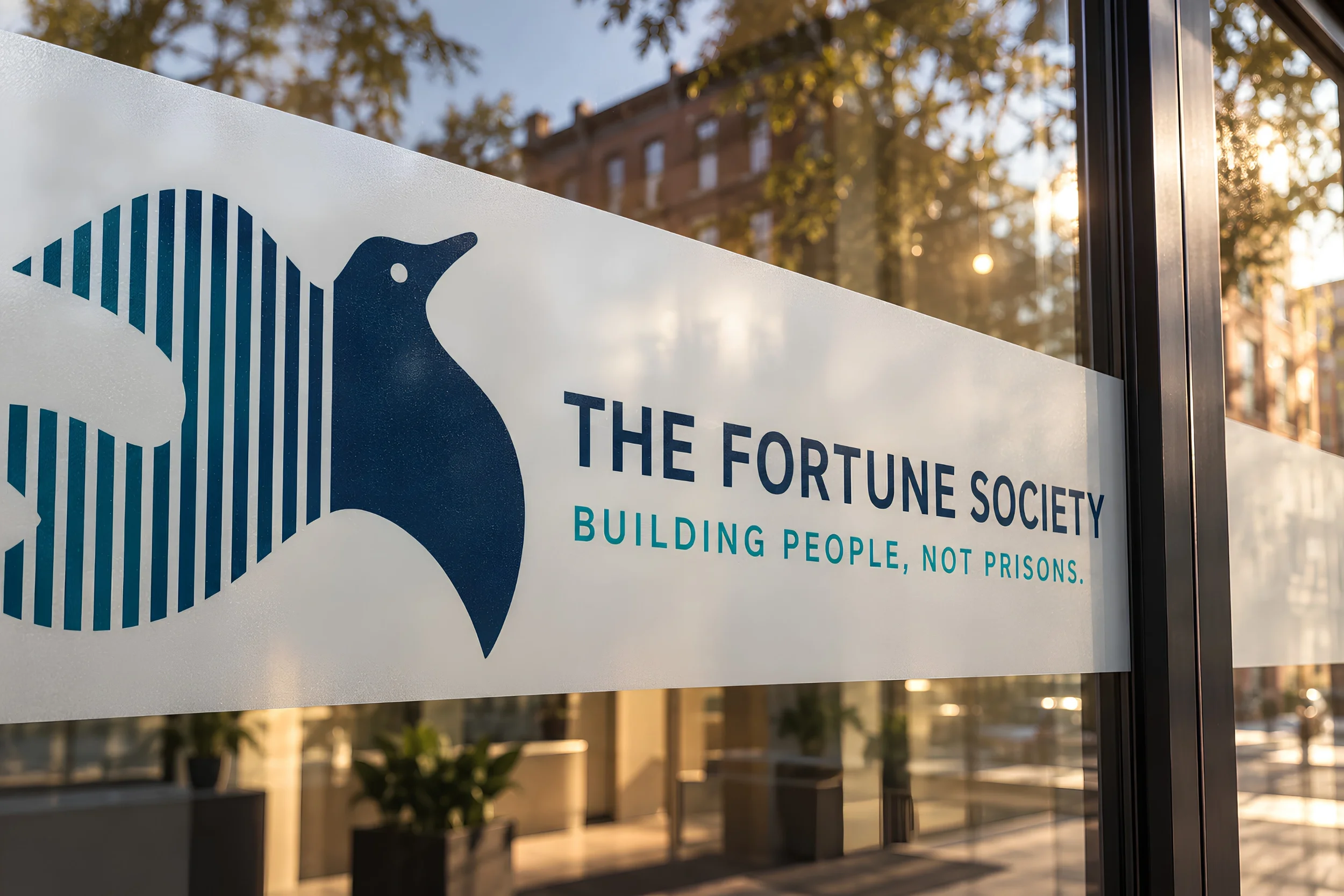
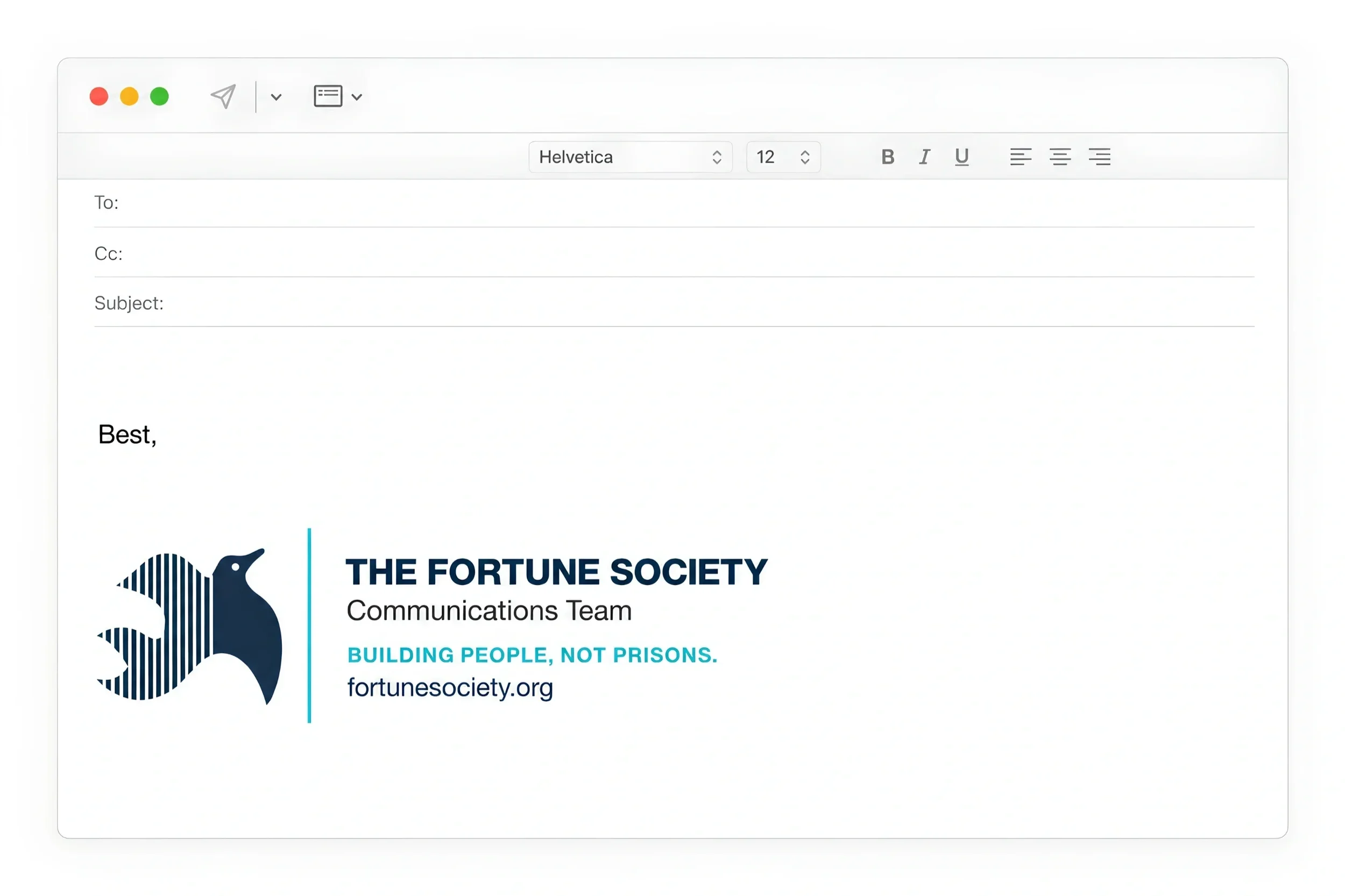
Additional collateral, internal communications, and digital touchpoints shown here were developed as portfolio extensions to demonstrate how the visual system scale across the organization.
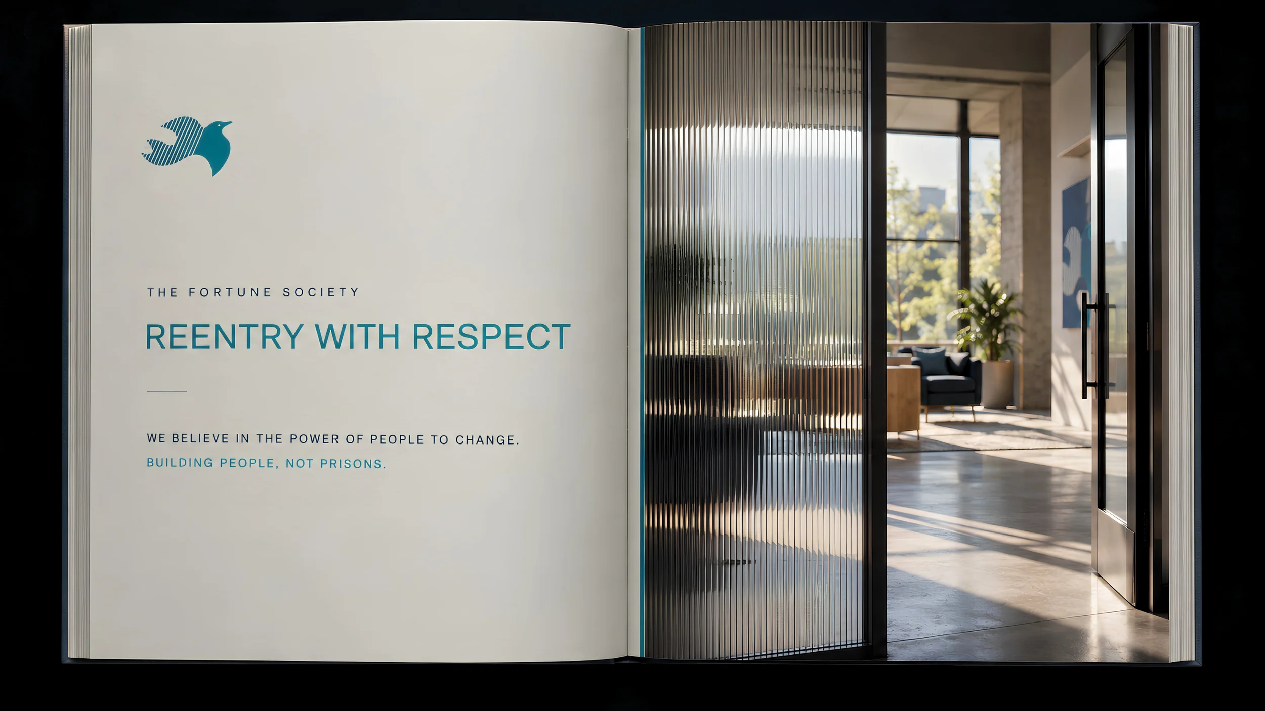
01 — OverviewReentry with respect.
Comprehensive brand guidelines developed for The Fortune Society, a nonprofit advancing reentry support and advocacy. Built upon a minimalist visual base, the system balances structural clarity with energetic expression. Through disciplined typography and an inclusive framework, the identity equips a diverse internal audience with a cohesive visual language that anchors communication, accessibility, and confidence.

02 — THE APPROACH
A foundation for advocacy.
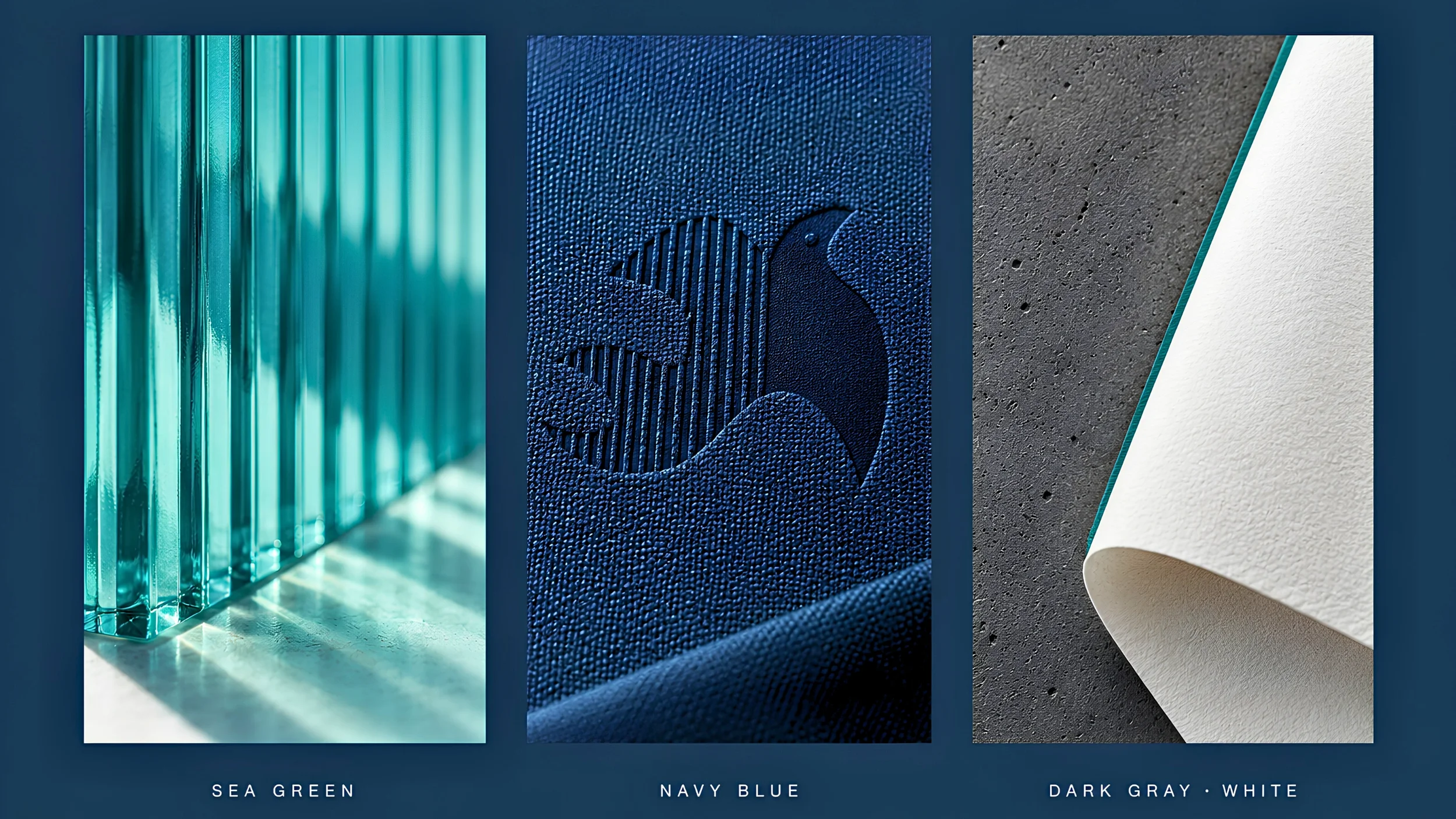
A consistent grid and typographic hierarchy keep complex advocacy collateral clear. Standardized colors, spacing, and brand touchpoints create a flexible structure that ensures coherent, accessible, and aligned internal communications.

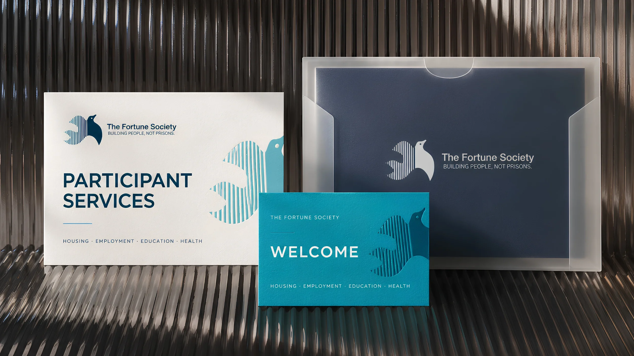
03 — IN PRACTICEDesigned for internal clarity.
Standardized typography, color, and layouts enable a diverse team to produce consistent, confident collateral aligned with reentry support.