SOLA — skincare with a pharmacopoeia botanical sensibility.
SCOPE OF WORK
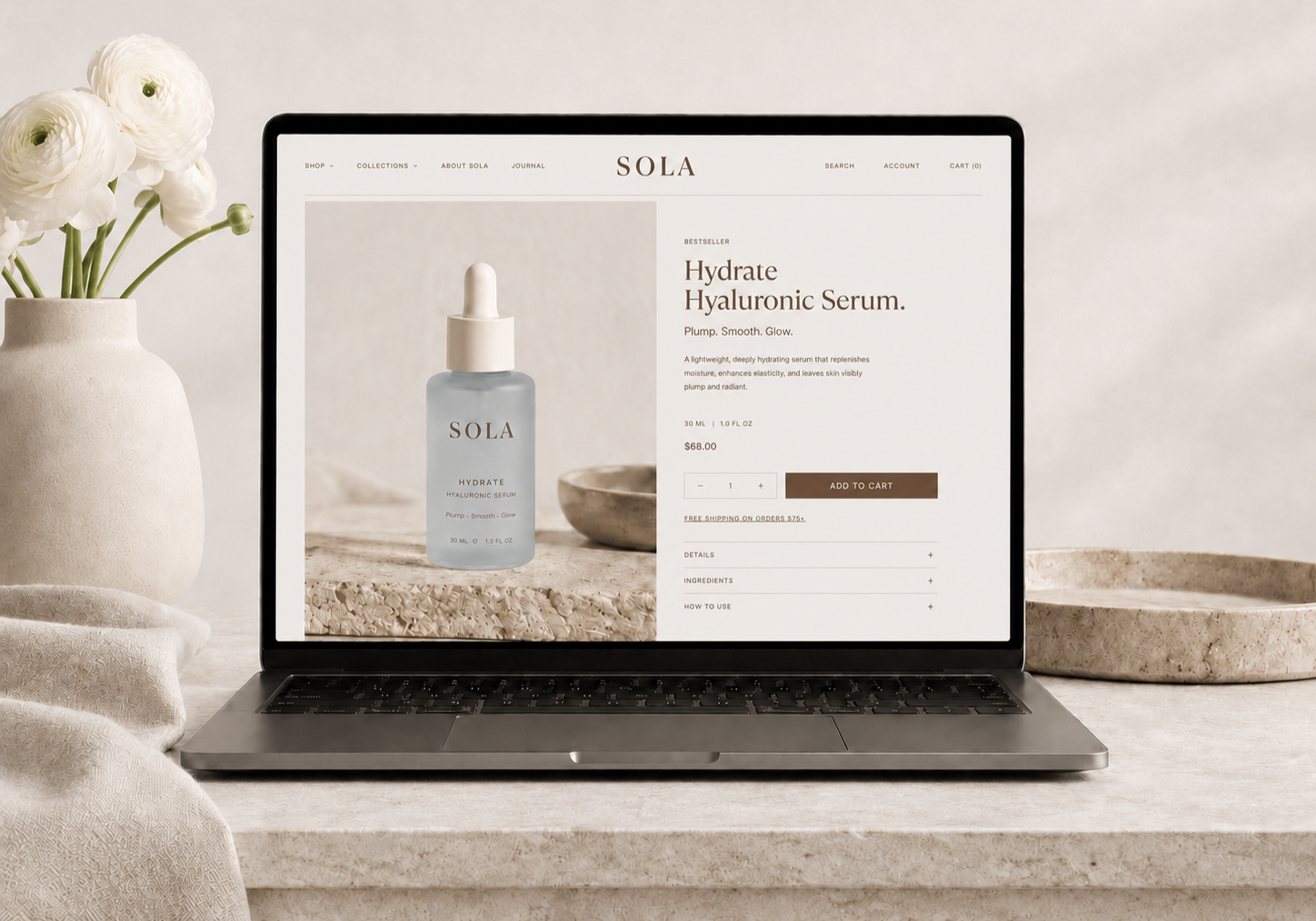
Identity · Art Direction · Packaging · Digital · Retail Display
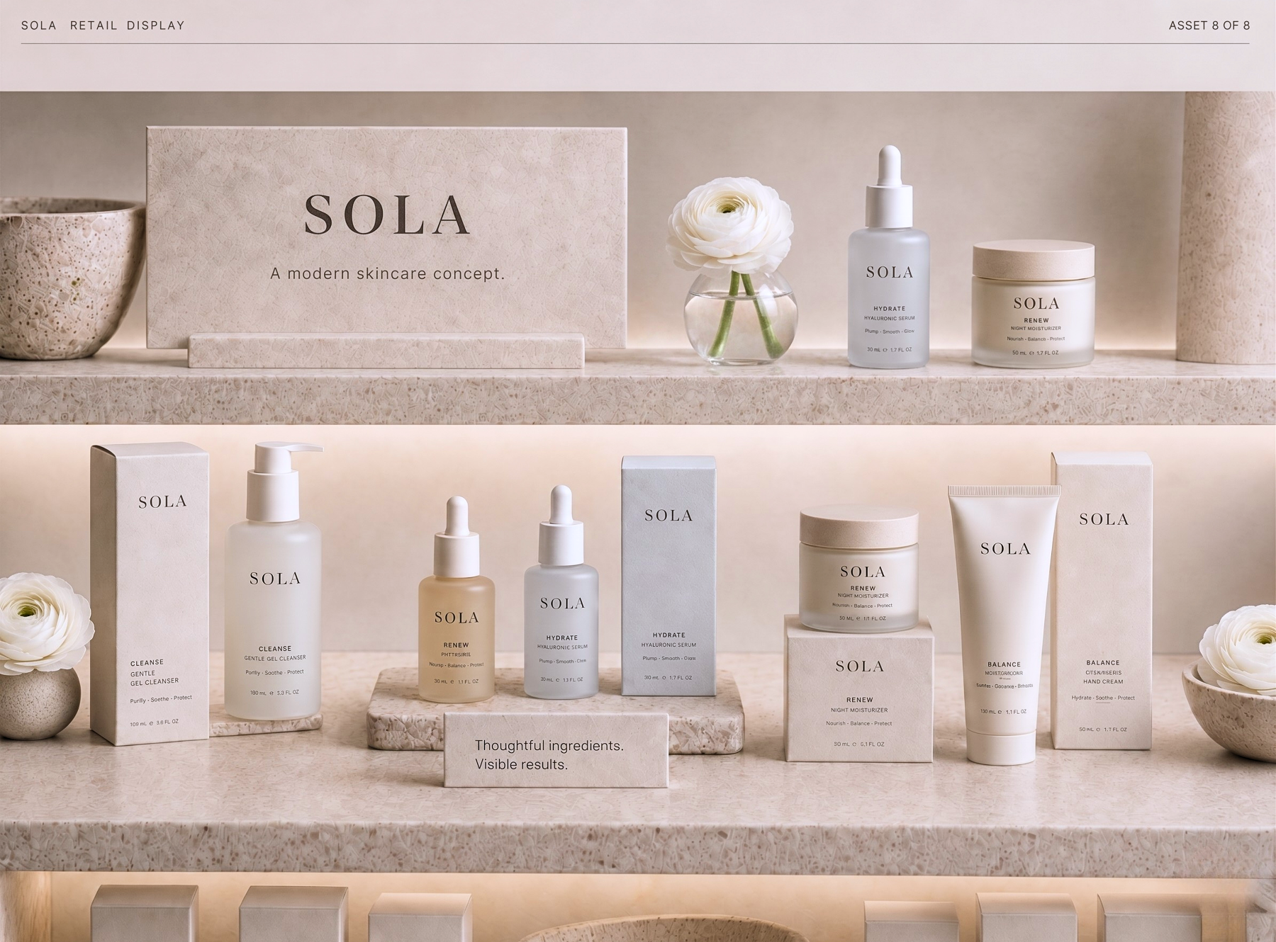
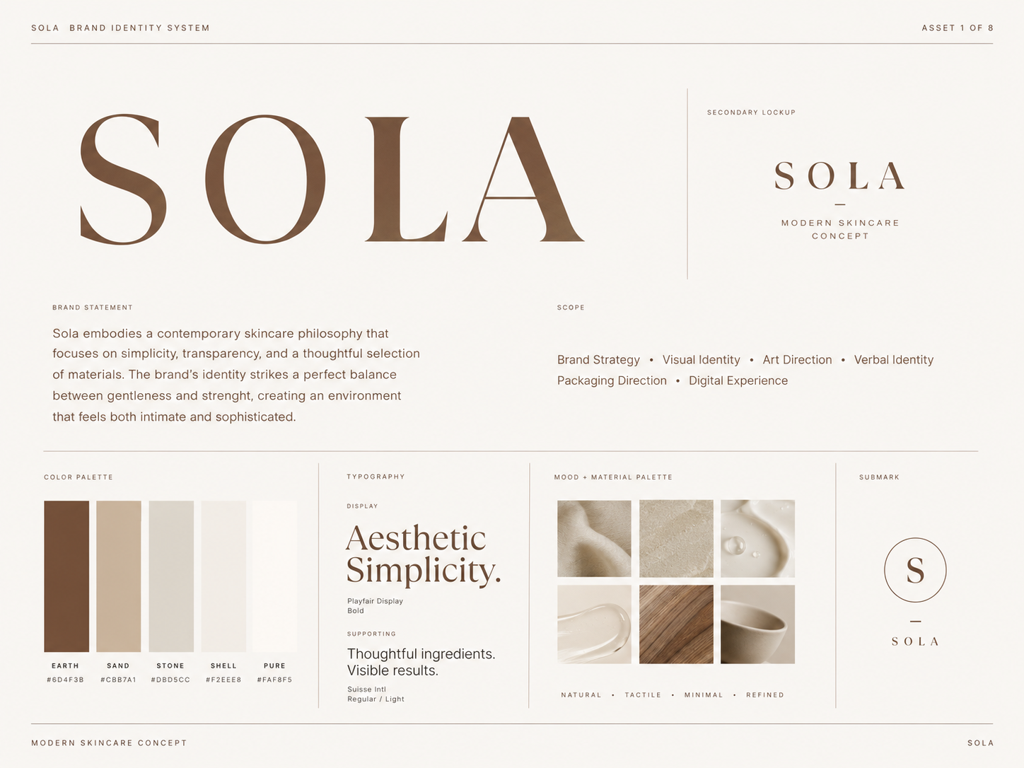
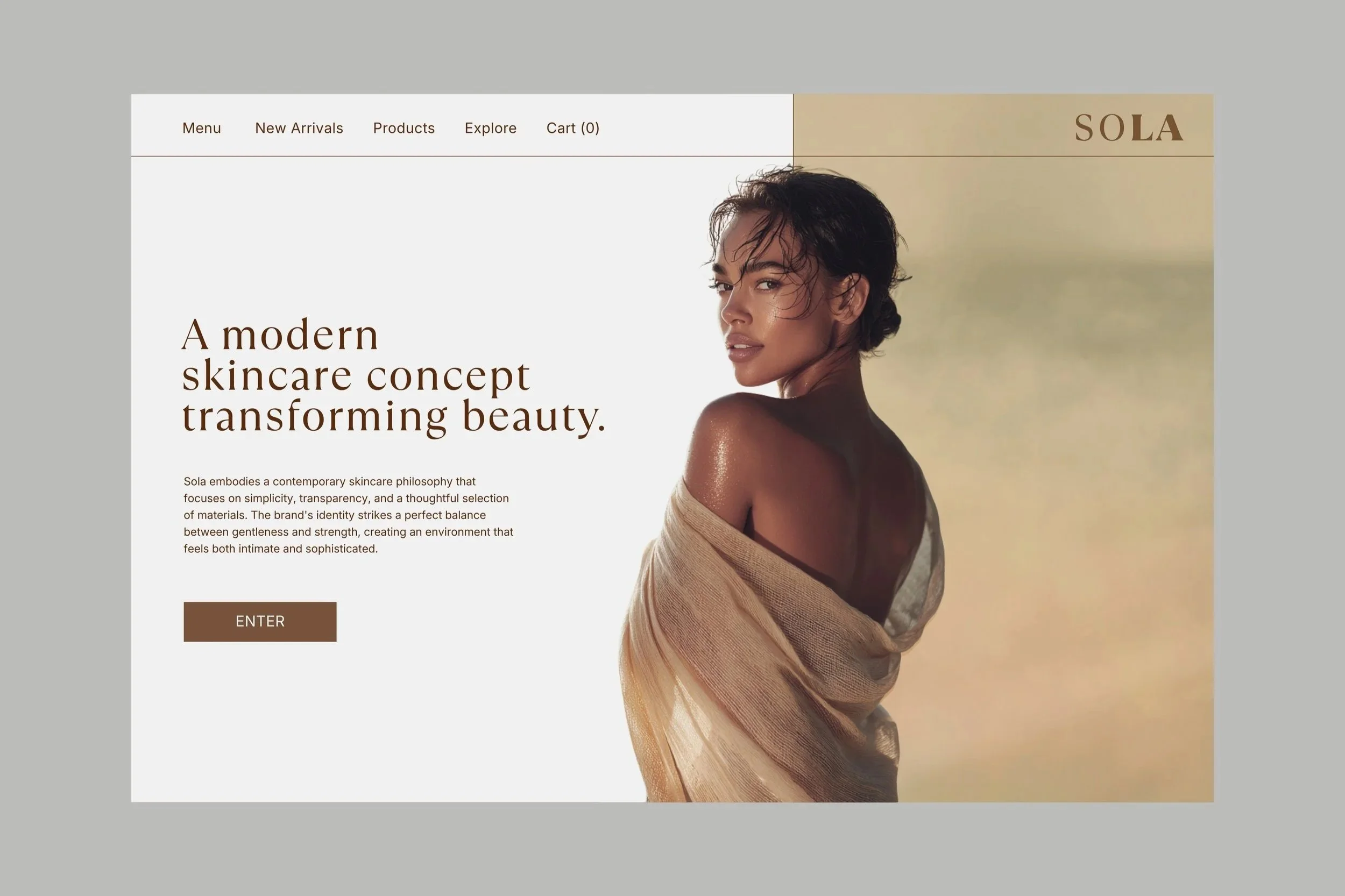
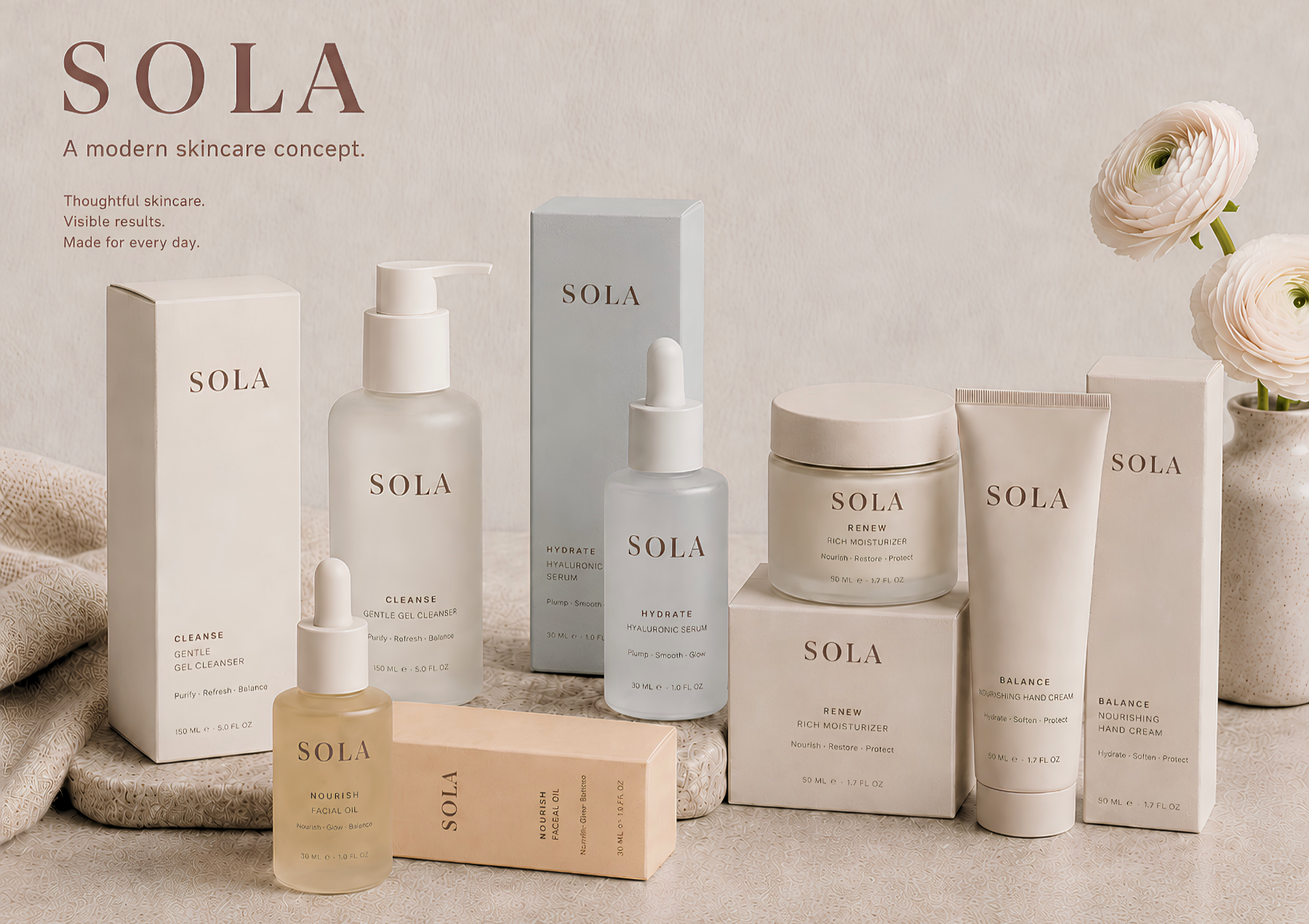
01 — OverviewSkincare as a typography problem.
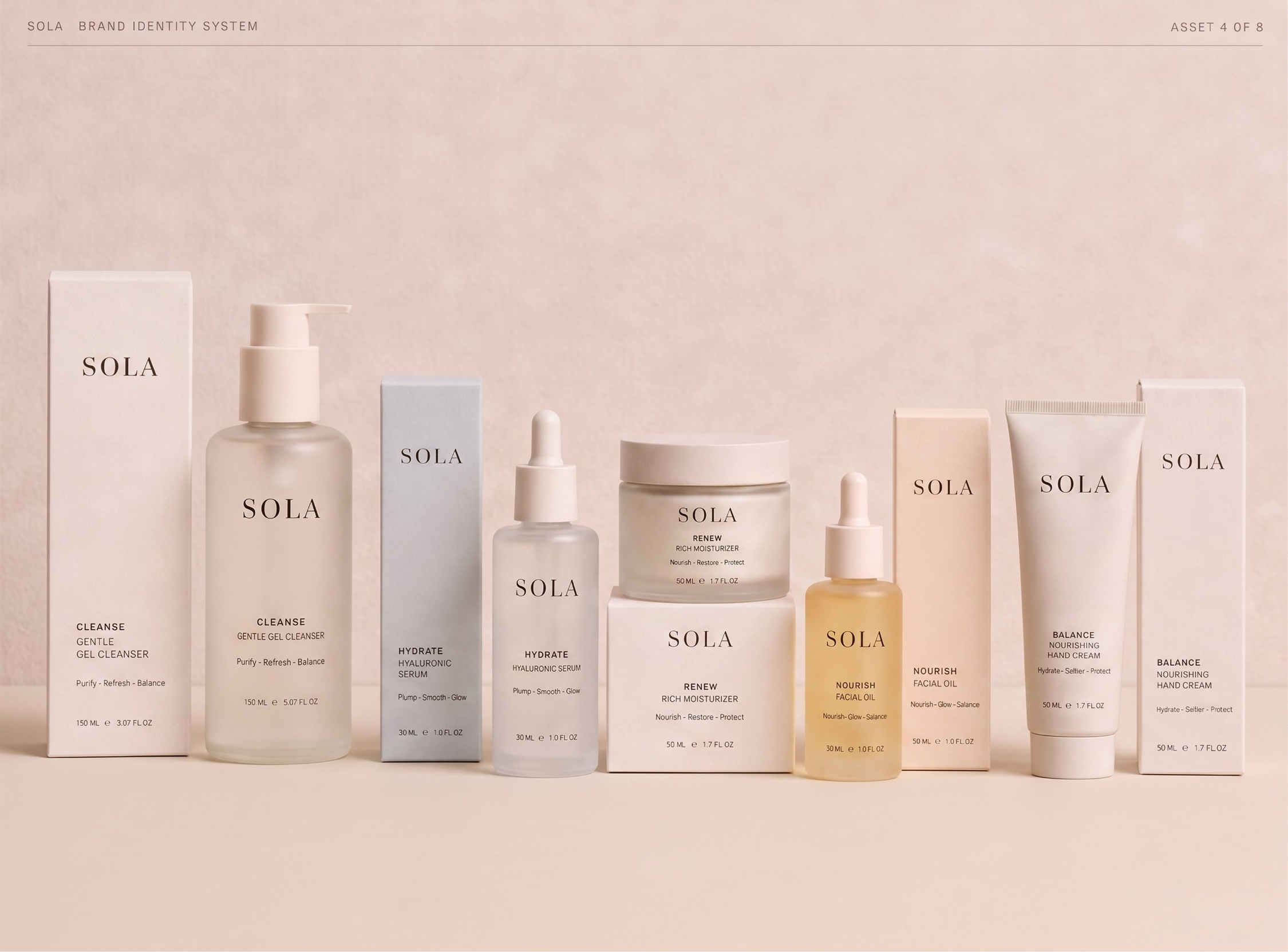
Sola is a conceptual skincare system built around clarity, hierarchy, and quiet botanical restraint. The project treats skincare packaging as an information-design challenge — organizing product names, ingredient cues, usage details, and category distinctions into a label system that feels clinical and natural at once, without leaning into the clichés of either category.
PRONUNCIATIONSO · LA
/ˈsoʊ.lɑː/
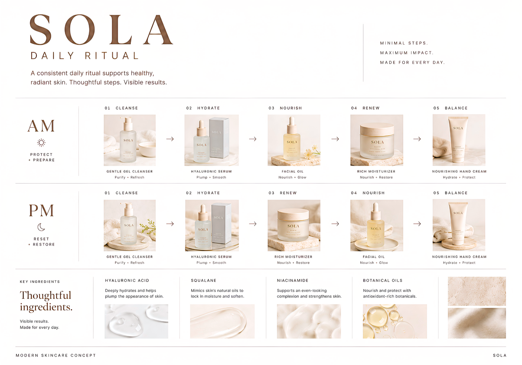
02 — APPROACHOne system. Multiple SKUs.
Pharmacopoeia structure.
The label system references the clarity of clinical and pharmaceutical packaging, using hierarchy, spacing, and information architecture to create a sense of precision without feeling sterile.
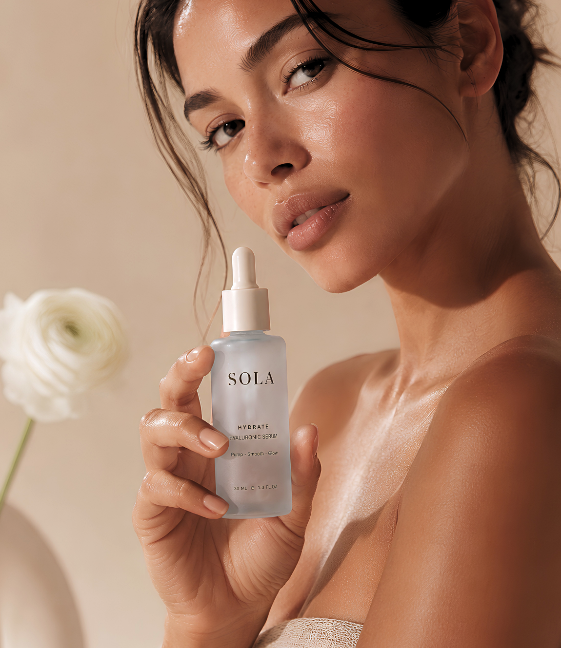
Botanical sensibility.
A muted natural palette and serif-led type system bring warmth, tactility, and softness to the range, balancing technical structure with a more human, daily-ritual tone.
Scalable trade dress.
A flexible visual system allows each product to feel distinct while remaining part of one recognizable family across packaging, digital, and campaign applications.