LINEA — details, made personal.
SCOPE OF WORK
Identity · Stationery · Web · Environment
01 — OverviewA boutique practice that reads as considered, not cosmetic.
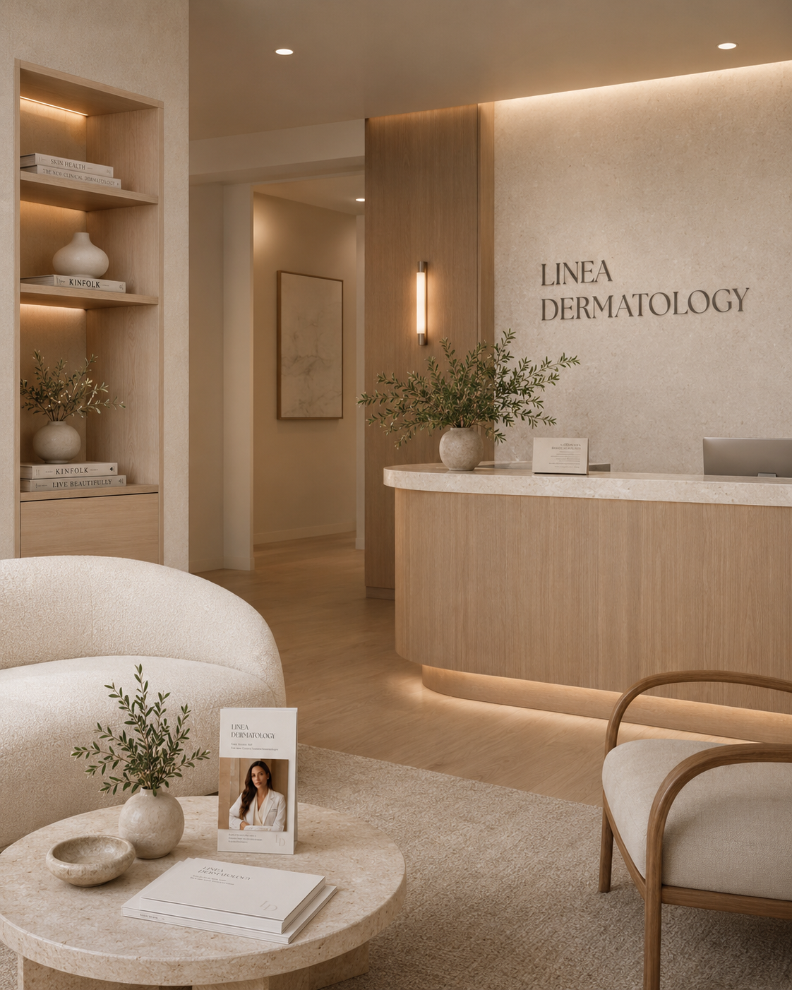
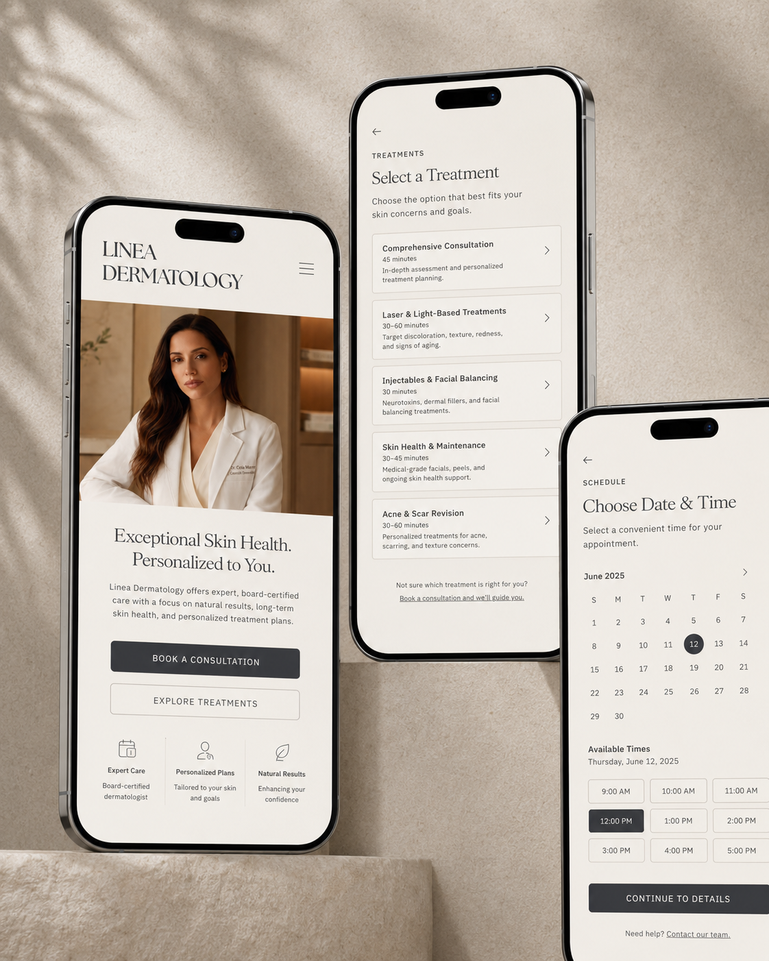
Boutique dermatology usually falls into two camps: clinical and cold, or wellness and vague. Linea is between them. Its single idea is consultation before treatment — reflected in the name, materials, rooms, and screens. Quiet restraint replaces loud marketing.
02 — APPROACHDrawn to a fine line.
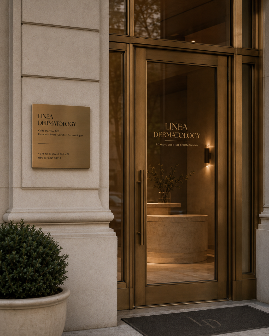
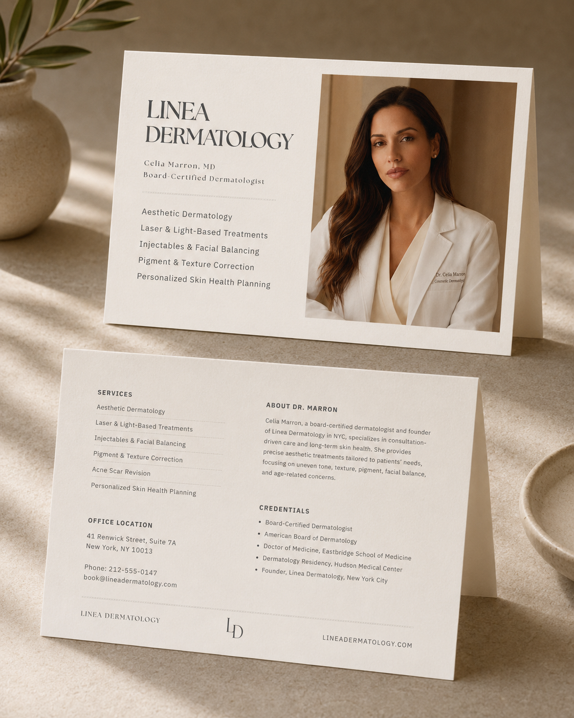
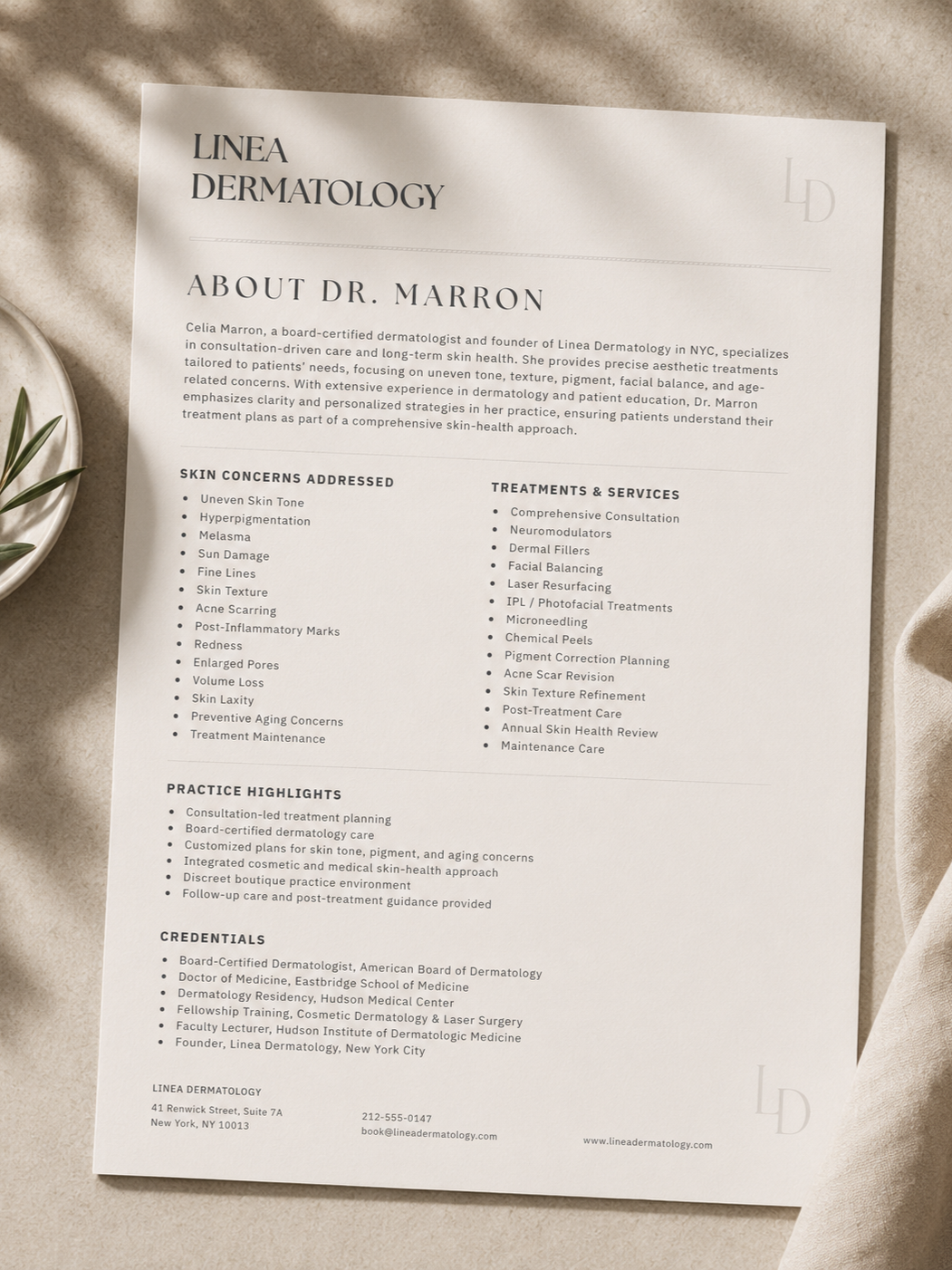
A literary wordmark, a quiet monogram. LINEA stacked over DERMATOLOGY in a high-contrast serif that reads as masthead, not signage — with an interlocking LD for the door, the stamp, and the corner of every card.
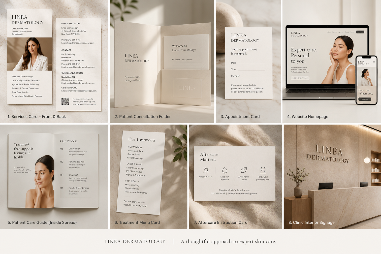
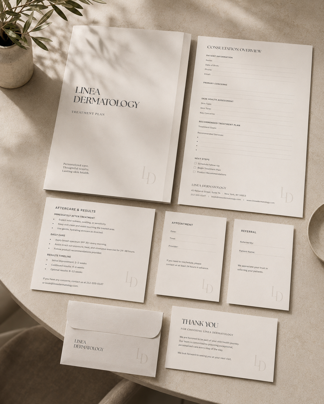
Stationery as the practice's voice. Consultation overview, treatment plan, aftercare, referral — one editorial system that makes a medical visit feel personal and clear, in the hand before it happens in the room.
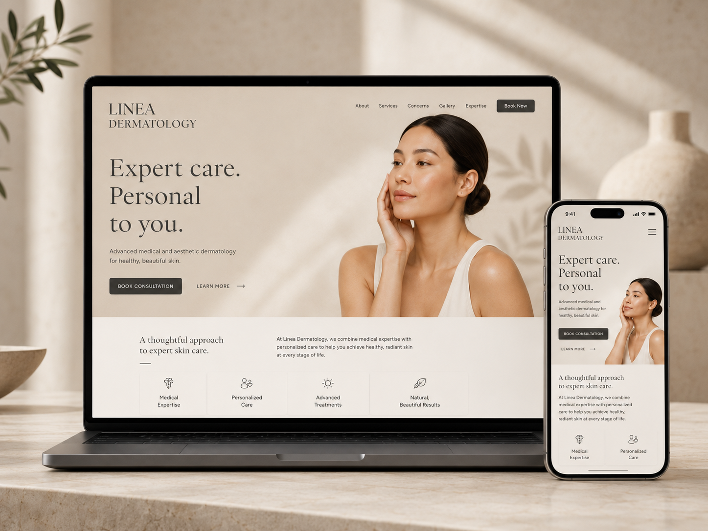
One warm neutral world. Cream, sand, brass, espresso — and no second accent. The palette holds from the brass door plaque to the booking screen without a single adjustment.
The LockupLINEA DERMATOLOGY
Linea — Latin · a line. Consultation, drawn first.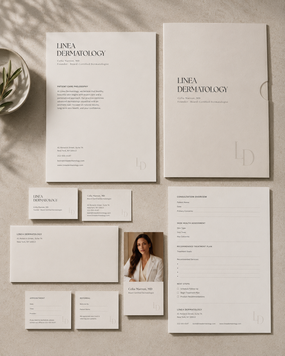
The line is the brand — drawn once, held everywhere.
03 — IN PRACTICEWhy restraint, before reassurance?
Healthcare identity rehearsed as editorial restraint: a board-certified practice that earns trust by saying less. Name, stationery, environment, and a booking flow that all carry one register — calm, exact, personal.
Presented as a full identity package — print system, responsive site, and a mobile booking flow.