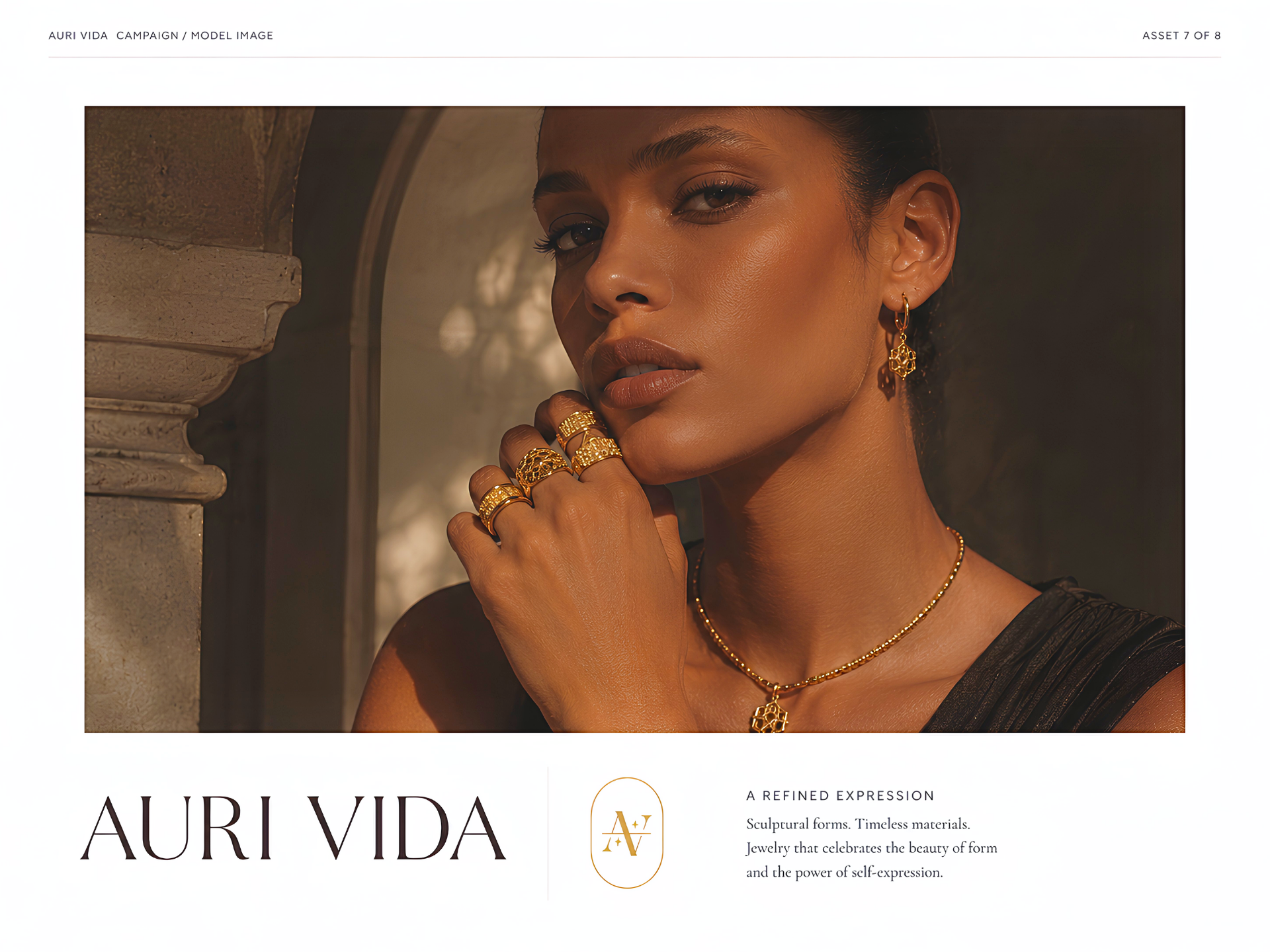
AURI VIDA - a jewelry
house drawn around
skin, light, and stone.
REGISTER
Identity · Retail · Packaging · Digital · Campaign
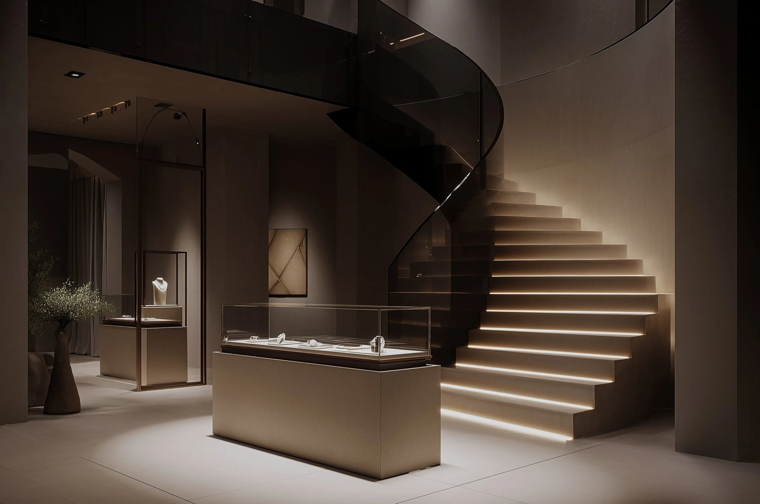
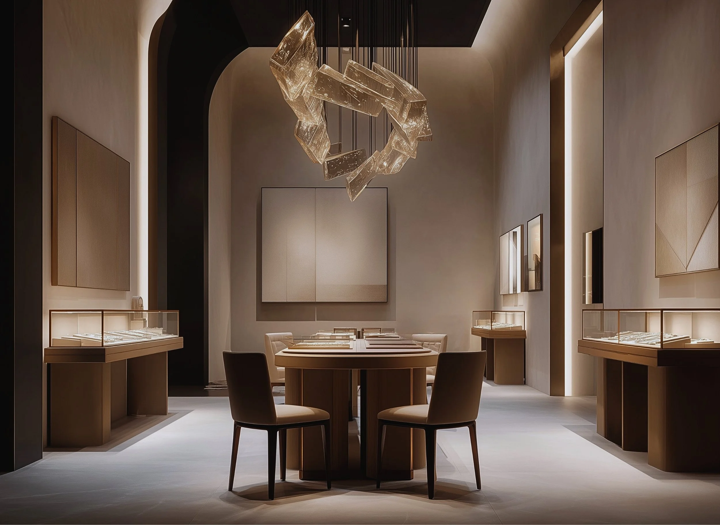
01 — overviewA house, not a label.
Fine jewelry built around the language of architecture — sculptural metalwork, warm light on skin and stone. Where most jewelry brands lead with product shots and stockist lists, Auri Vida begins with the house: facade, salon, appointment, box. One register across five surfaces, held to a single question: does it survive from storefront to certificate card?
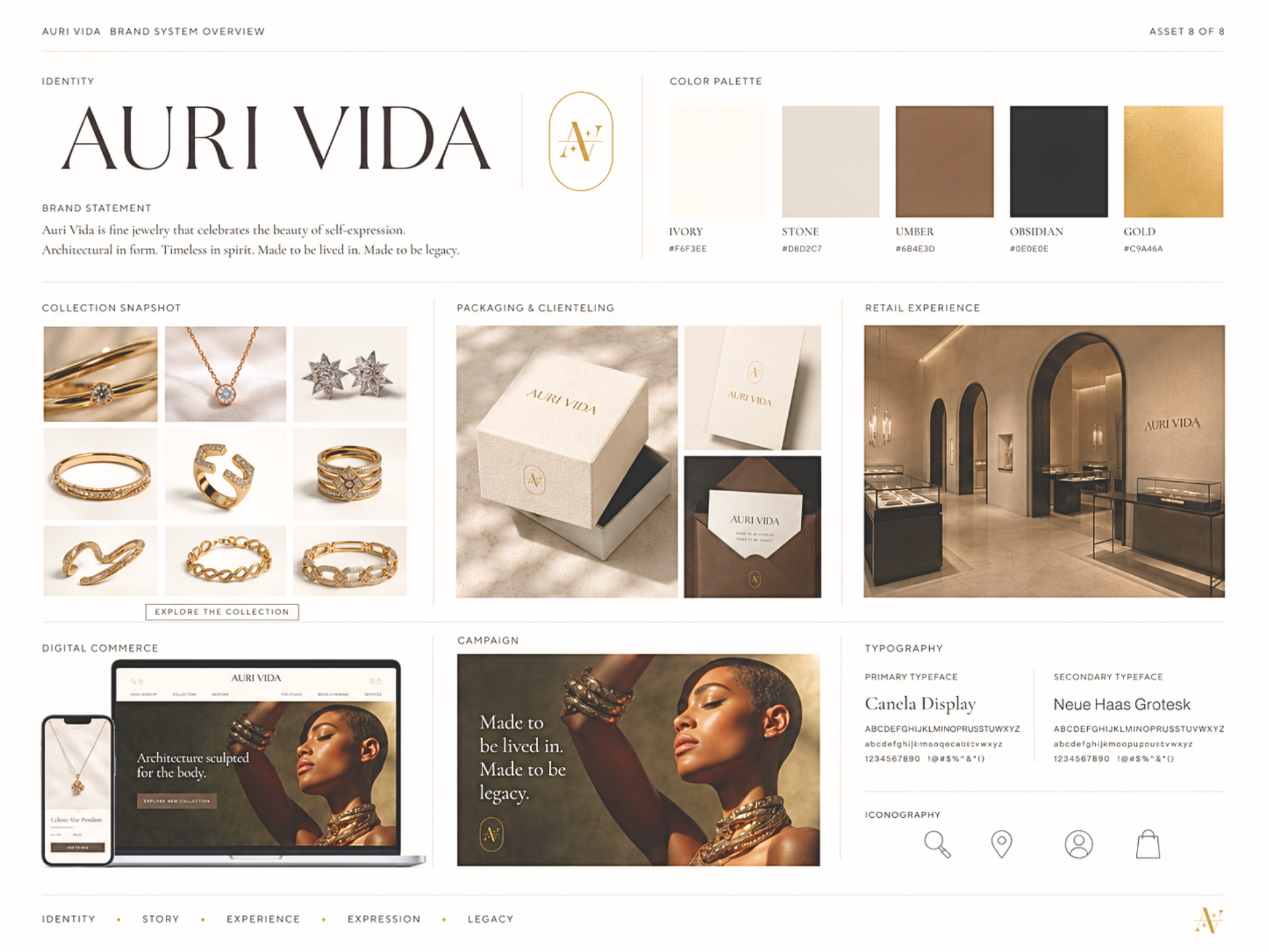
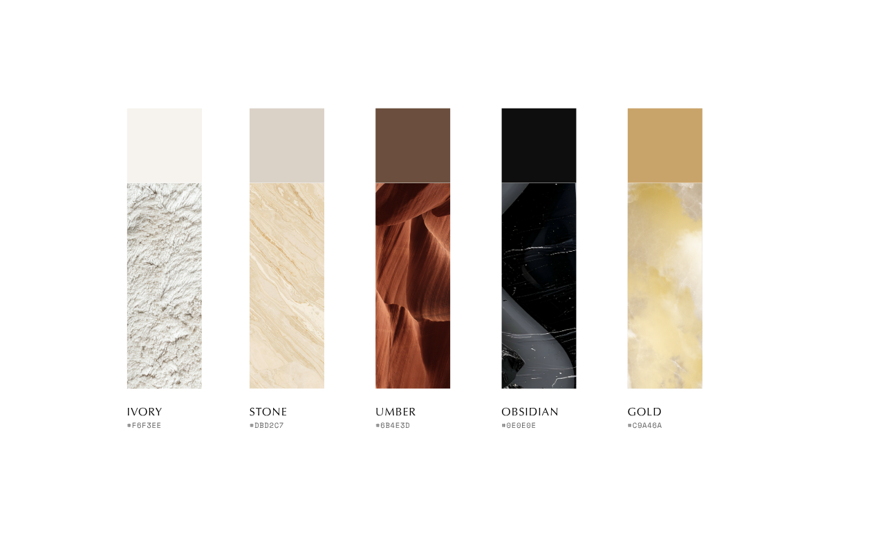
§ — Material Palette02 — approachArchitecture first. Catalog second.
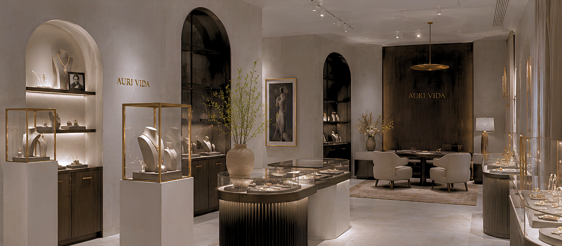
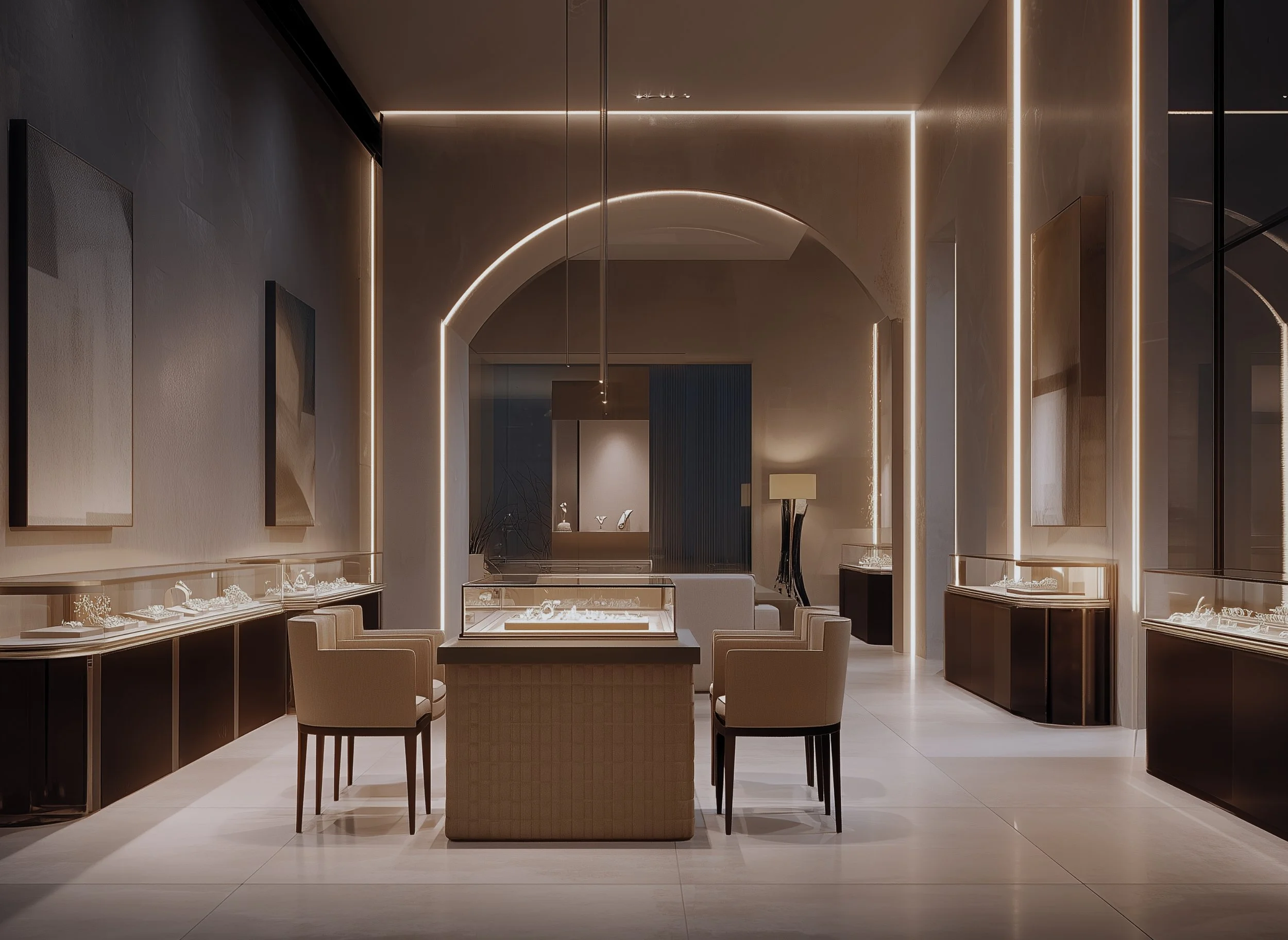
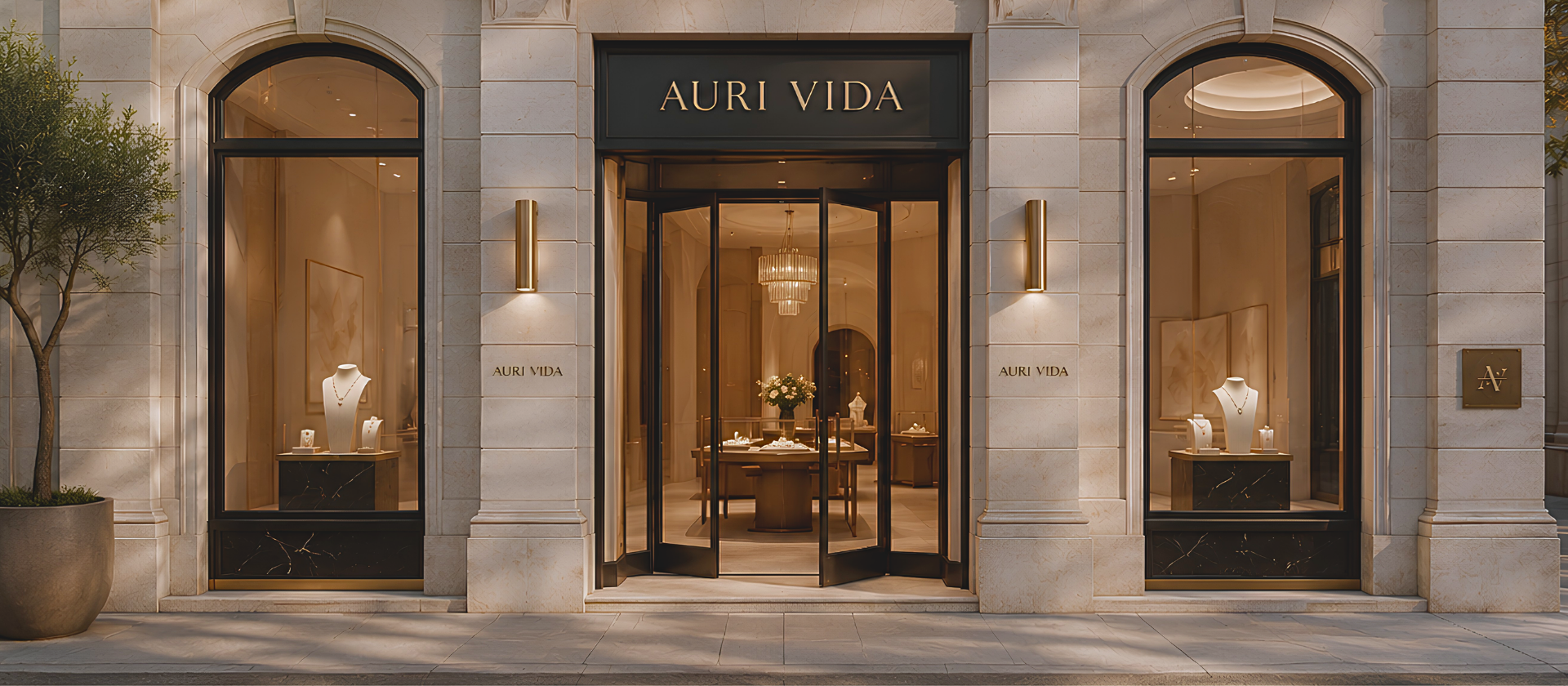
The house leads. Facade, salon, and wordmark — drawn before the first collection is shot. A house with no salon has nothing to defend against the season-two lookalike.
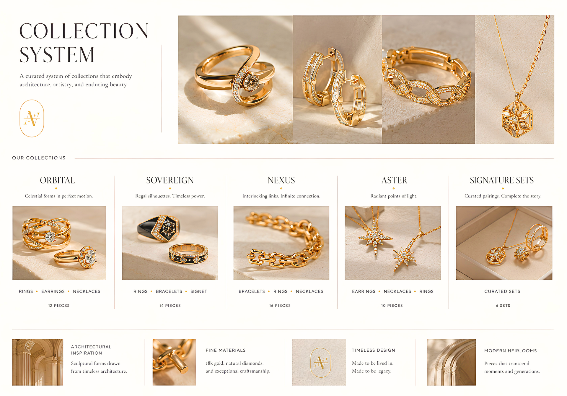
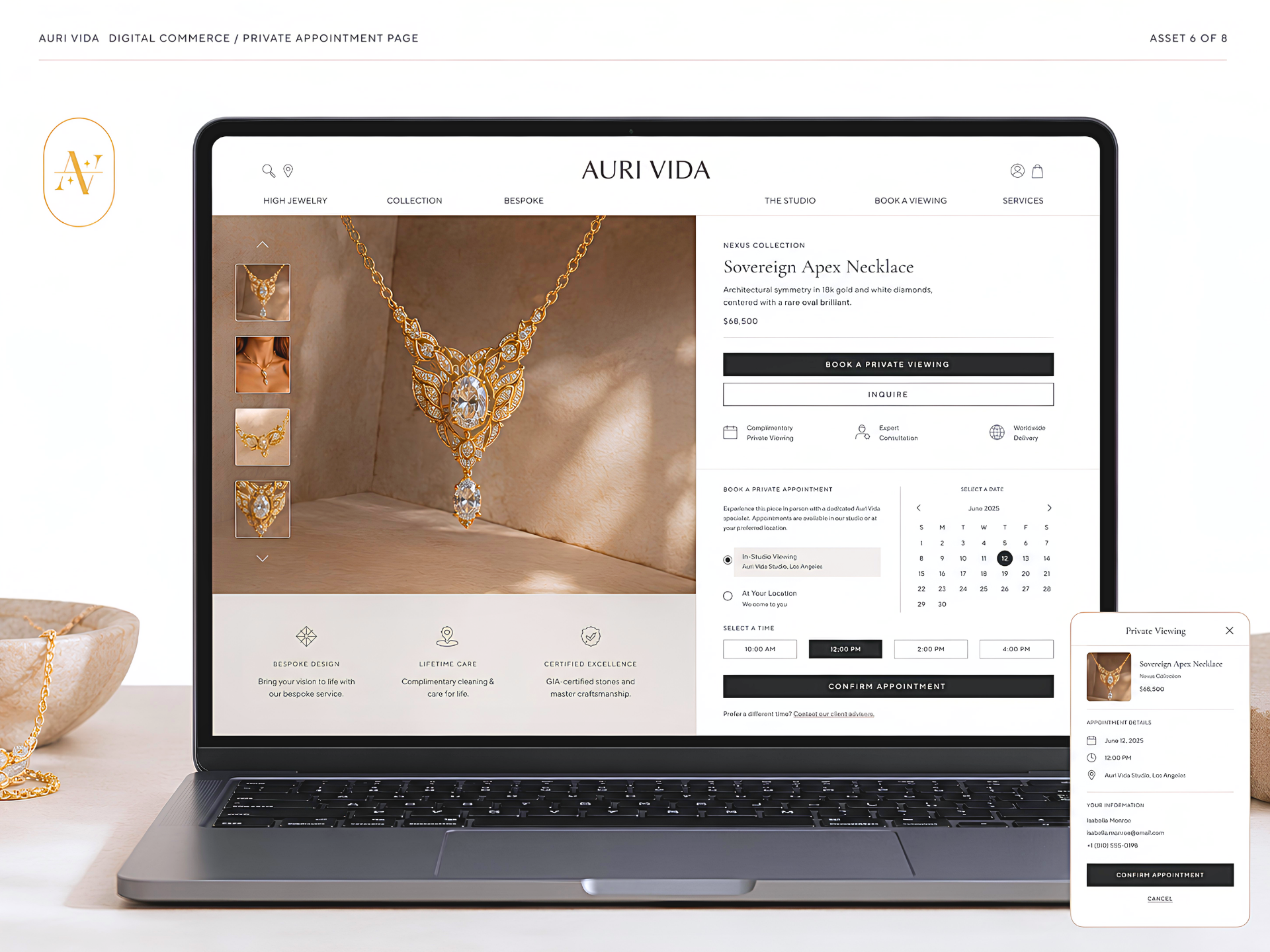
A system, not a catalog. Five collections, each a defensible silhouette with a one-sentence premise. The catalog is the consequence, not the strategy.
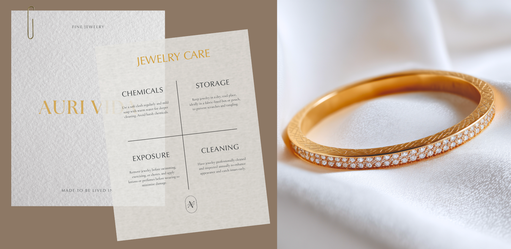
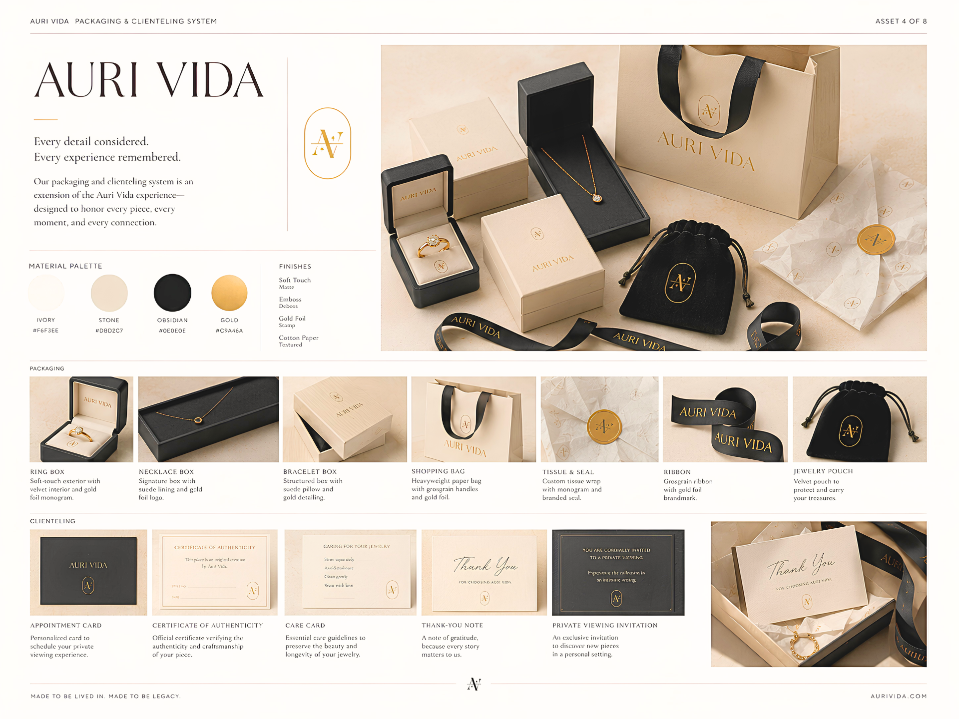
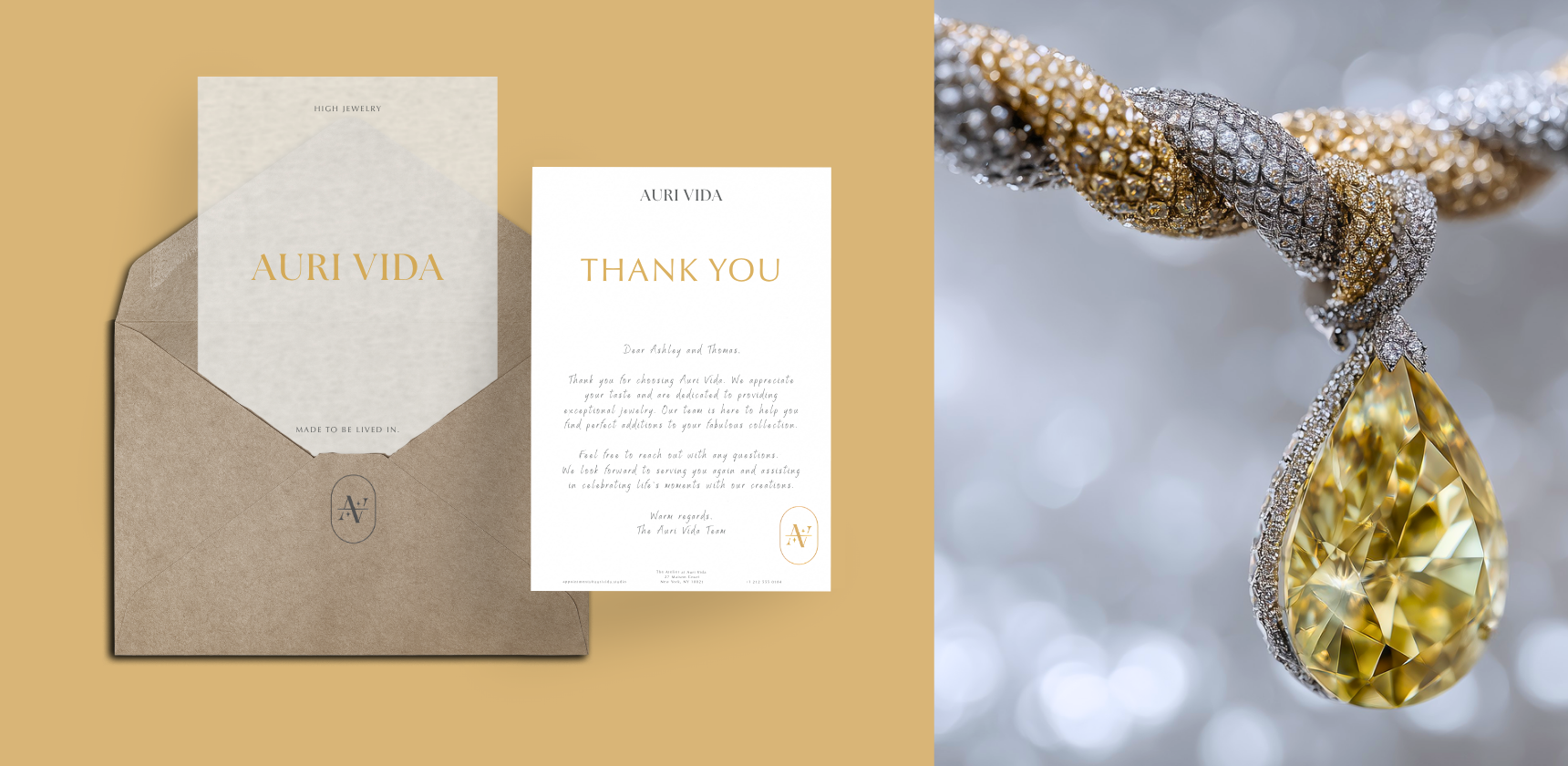
Clienteling as packaging. Card, certificate, care note, viewing invitation — held to the standard of the box. The piece travels home on five printed surfaces; each is brand.